 |
| This is the self-portrait I made in Adobe Illustrator. In total this took me almost twenty hours to complete, but it was a pretty fun project! |
Monday, March 31, 2014
Self-Portrait

Thursday, March 13, 2014
Redesigned Logo
In an effort to "redesign a logo", I thought about products I like that would work with recreating a logo. Being a born-and-raised Marylander, Old Bay is understandably one of the products that quickly came to mind.
I decided to create a completely new product out of the classic Maryland seasoning.
"Bae" is a slang term for "baby", which is often used to refer to one's significant other; so I figured I'd use that to make the product of Old Bay into Old Bae, and make it something that lent itself specifically toward women.
The process in creating this image involved using Adobe Illustrator to draw a replica of the basic parts of the logo, adding my own type, and recreating the three images that are on the left side of the logo, and adding shadow and dimension to give it a more realistic appearance.
Here is the result!
 |
| Original "Old Bay" logo |
 |
| New "Old Bae" original logo |
Monday, March 10, 2014
Artist Post 4: Danilo Gato

 |
| Liv Tyler (web site) |
 |
| Angelina Jolie (web site) |
 |
| Batman (web site) |
He creates his art on Adobe Illustrator by first bringing in a photograph of what he is going to create. He uses vectors to isolate sections of the image, and colors each one in separately. This is like what we learned to do in class, and it was neat to know that I used the same methods as a more advanced and experienced artist! Something that is common in his works is that the background is always left up to the imagination. He creates a simple graphic pattern to place behind the person in the foreground.
I think that he is quite a talented vector artist. His style is realistic and strikingly accurate. I like how relatable his work is to the work we are currently doing in class. It gives a good representation of one of the many styles to use when it comes to making vector art. This is just personal opinion, but I think that his art might be more interesting if he gave his pieces a more detailed background that presented a sense of space or another form of interest. What he uses as a background, though it does leave something up to one's imagination, is almost too ambiguous. But overall, he is talented and does a great job with his celebrity and character portraits.
Sunday, March 2, 2014
Music Drawing
 |
| While exploring Adobe Illustrator, I listened to a piece of music and created an image that I thought represented the sound of the piece. To me, the sound of the music was eerie and sharp, but at the same time it was captivating. This made me think of the way we sometimes listen to music even though it makes us sad or angry, not because we like the sound of the music necessarily, but because it brings about a certain emotion in us which is powerful or important to us. Music that gives us strong emotion may trigger memories that begin to cloud our minds and get "tangled up in our hair". I used multiple tools, including several kinds of paint strokes, thicknesses, and colors. I also created shapes and warped them in many ways and gave them certain levels of transparency to create a visual of "clouded thought". As a rest of that, here is my first image created in Adobe Illustrator! |
Wednesday, February 26, 2014
Potential Portraits to Use in Adobe Illustrator Project
Here are a few portraits I've gathered as ideas for the Adobe Illustrator Project I will be beginning:
 |
| (Photo by Abby Doyle) |


Monday, February 24, 2014
Artist Post 3: Harold Cohen
 |
| Harold Cohen (web site) |
 |
| (web site) |
 |
| "Coming Home" (web site) |
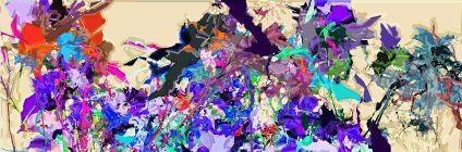
Harold Cohen is the creator of a program called AARON, which is a computer program "designed to produce art autonomously" (web site) with which he creates his works as a retired artist in California today. "AARON developed from a fascination with the process of line-making and how enclosed forms, or shapes, were drawn on paper; initially Cohen did not approach his programming as an artistic activity, but rather a disciplined research into the grammar of conceptual space. He initially saw AARON as a program that emulated what humans did; then as an autonomous entity" (web site).


How AARON works is that Cohen encodes the basic structures for the images into the program and uses its "knowledge" of relative sizes (of body parts for instance) to create the image. This is interesting in that each time the program is used, even with the same structures encoded, the art can come out completely different than before.
Cohen's work stands out to me first and foremost because if the striking colors and energetic mood that his pieces emit. I love the bright colors and the creative forms that reveal themselves to be recognizable objects.
I do not completely understand, however, the process by which these works are created. The information I have found about the AARON program was a little abstract and I would liked to have been able to find out some more a bout how the art is created. Nevertheless, the finished product is very pleasing to the eye and I like it quite a lot. I do not see much political, racial, ethnic, environmental, etc, importance in his works, which is also interesting to me. I just see a celebration of colors and energy. Pretty cool stuff!
Thursday, February 6, 2014
Artist Post 2: Beatrice Boyle
Beatrice Boyle is an artist who graduated from the London College of Fashion in 2008 who uses her exposure of the world of fashion to make a statement about what beauty really means in the consumer world.


 |
| Beatrice Boyle standing next to one of her creations. |


She does this by "[painting] over images of models to distort the message of consumerism in contemporary fashion magazines" according to the web site for her art, "Dazed". She claims to have an obsession with magazines, which is what inspired her creativity with this kind of art. She would rip the pages out of fashion magazines and distort them with the goal of altering the meaning of of the models in the magazines from being "a commodity to a work of art"(Dazed). She then began photographing the models herself and using her own pictures to distort and paint over.

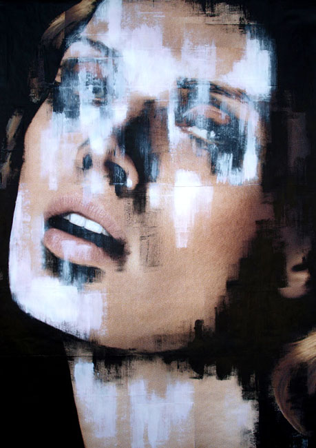

I find Beatrice Boyle's art intriguing, especially since it is coming from such a young artist. I am curious as to why, having graduated from a Fashion University, she would end up defacing (in a sense) that very thing which she became so immersed in. Perhaps it was because she was able to see the true colors of the fashion industry and the ways in which is corrupt - eating disorders of fashion models, to give one example - and was searching for a way to express this dislike for the culture of modeling. The fact that she paints over these photographs is in itself a way of defacing beauty and the idea of visual perfection of the human body. Regardless, I think that this is a brilliant form of art and one that I like quite a lot. I also see a relationship between the art of Beatrice Boyle and that of Nancy Burson (I wrote about her earlier in this blog). They both have found a way to express the concept of beauty and ask through their art what beauty really is and how valuable it is in the consumer world.
What makes Boyle's work so strong is the way she combines two completely different mediums (photography and paint) to create an entirely different generation of art. The message she gives through them, that fashion is like a string puppet of consumption, strengthens the art even more. To me, this is reflected a lot in the way that she seems to consistantly "scratch out" or sadden the eyes in her artwork.
Links to photos:

Subscribe to:
Posts (Atom)